Goodfinds
MAKING BLIND BROWSING MORE INTENTIONAL
I went to a carboot sale and tried on a £10 leather jacket that I didn't end up buying but probably should have (a random passerby also said it looked great).
While I didn't know whether I would find a jacket I liked, I went to the carboot sale knowing that I would find jackets there - the mystery of what you may find appeals to a lot of people, but intentional and blind browsing do not have to be so divorced.
My goal was UX that leads the user to events that would most likely provide the items they're looking for.
Committed to making it easier to find
Defining "Thrifting": to shop for or buy used goods especially at a store that specialises in secondhand merchandise.
GETTING TO KNOW THE USER
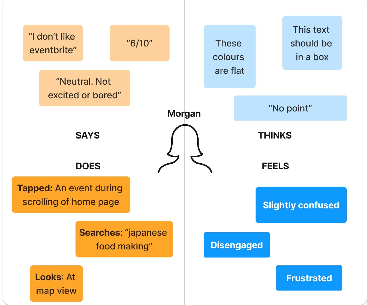
I had my interviewees do a usability exercise for Eventbrite (a market leader in the events space) while I observed behaviour and identified pain points.
It was also essential to gain unique perspectives (via surveys) on the thrifting experience outside of my own and conducting user interviews really helped me work through my own biases and see the broader picture.
4 user interview & usability participants
USER RESEARCH
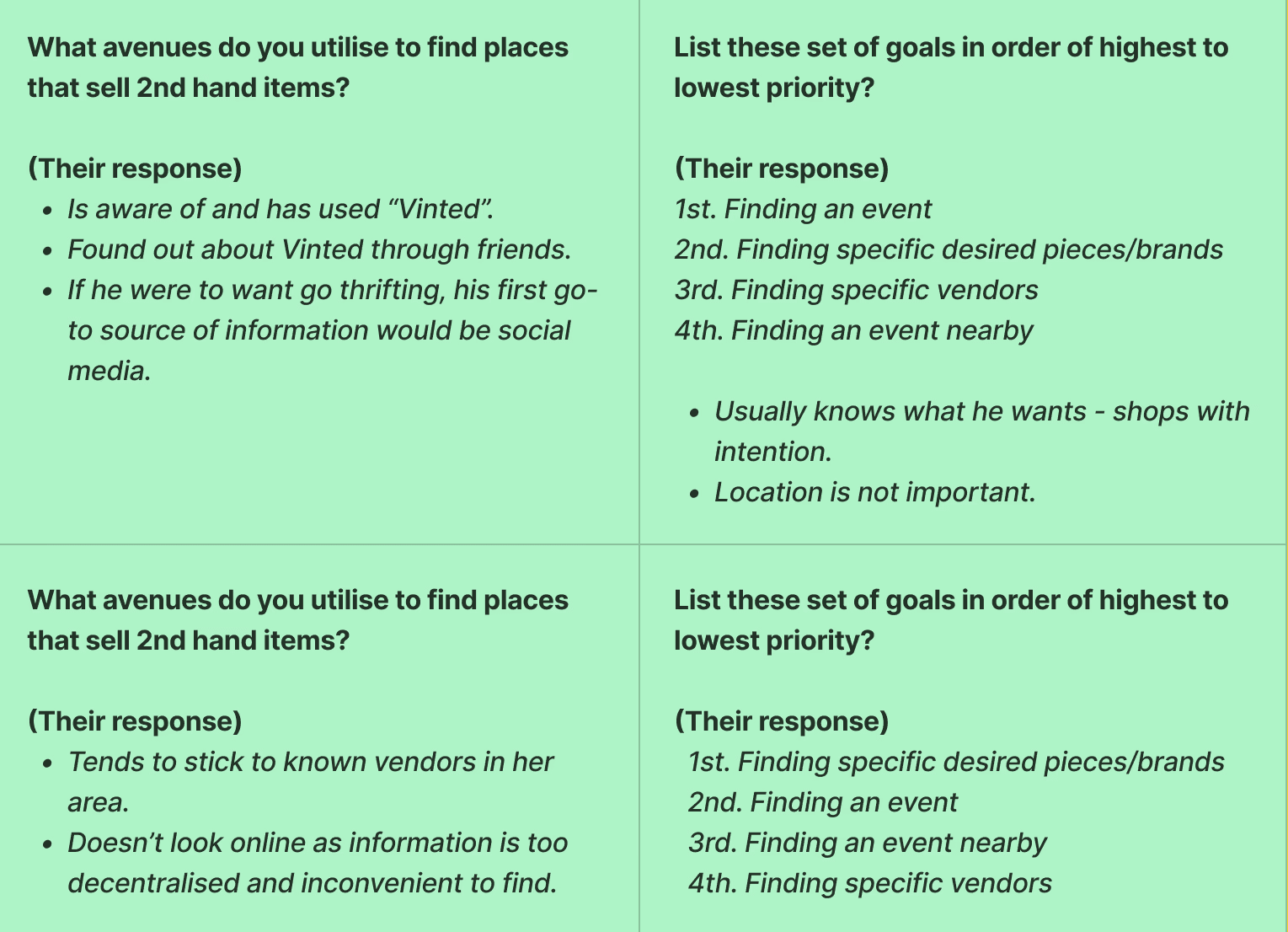
4 survey participants
Empathy map for persona
THERE'S AN "UNKNOWN INVENTORY" PROBLEM
My interviewees varied both in thrifting experience as well as what they get out of the process. One of them finds shopping in general quite tedious and another very much enjoys blindly browsing.
Though, one common thread I found was that a dedicated platform, where information on thrifting events and second-hand pop ups alike is more centralised and detailed, would incentivise them all to shop second-hand more often - the convenience of knowing where to look united completely different perspectives on thrifting.
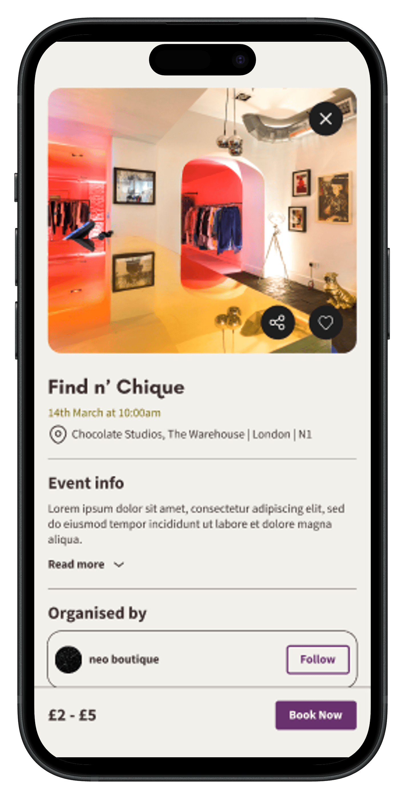

It wasn't enough for Goodfinds to just be a hub of information for thrifting events - My interviews highlighted that the problem is slightly bigger than that. Users want to know specifically where to look, to find what they want.
A UNIQUE SOLUTION, THAT MARKET LEADERS DON'T HAVE, WAS NEEDED
The UX on Dice and Eventbrite (leaders in the events sector) is intuitive and effectively directs users to events they want to attend so it's not a crime to stick to those standardised design systems. Though, I did notice that on both apps, users don't have a voice - the platforms are exclusively tailored to promote events and their organisers.
However, I felt that a more organic approach to helping users browse would better fit who I'm designing for and my goal.


BRINGING THE COMMUNITY ASPECT OF THRIFTING INTO THE UX OF THE APP
The second-hand vending community is a vibrant ecosystem of vendors who all trade with one another and happy customers who get to know a lot of the vendors on personal levels.
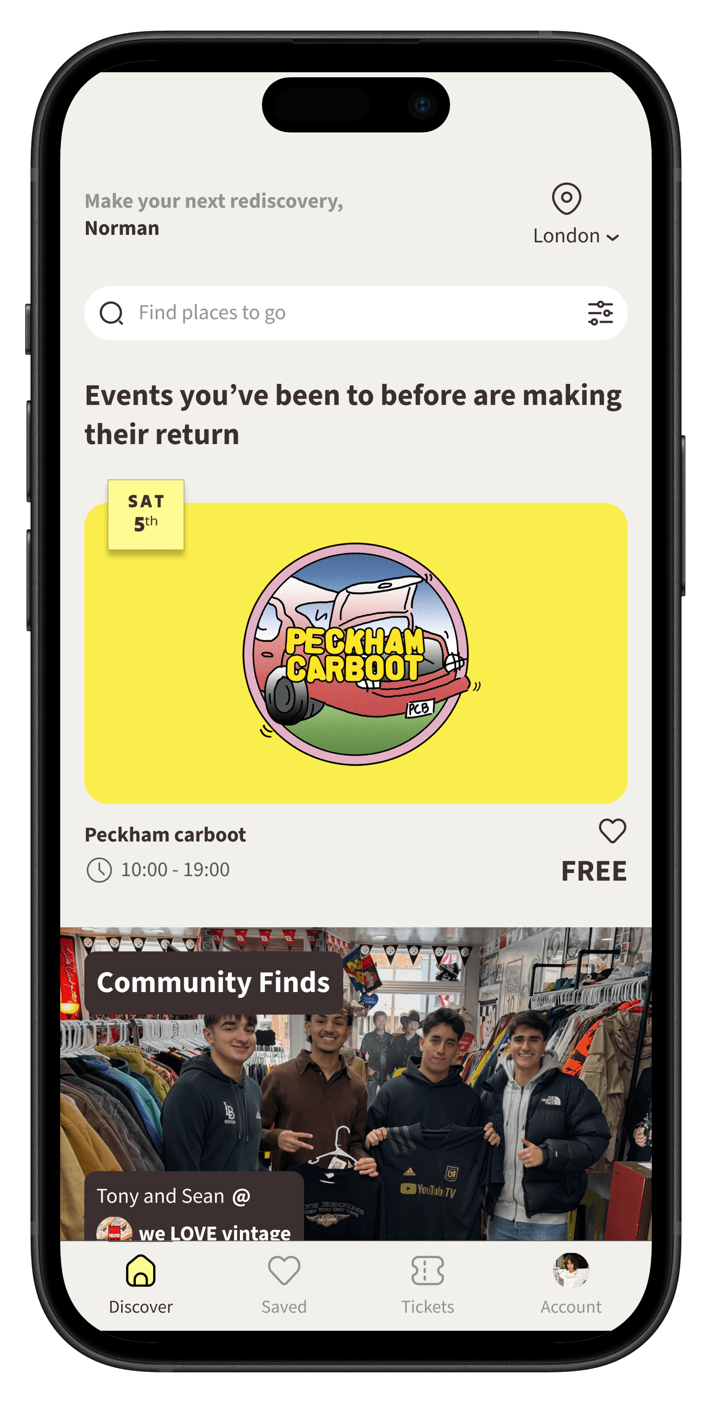
I felt the best way to represent this community aspect in the UX of the app is to allow the user to see what others have bought at these events.
Through features such as "Community Finds" and allowing users to post comments about what they found on the event pages - the old fashioned, "where did you get that?" word-of-mouth culture is brought to life in the functionality of Goodfinds.
FINAL DESIGNS
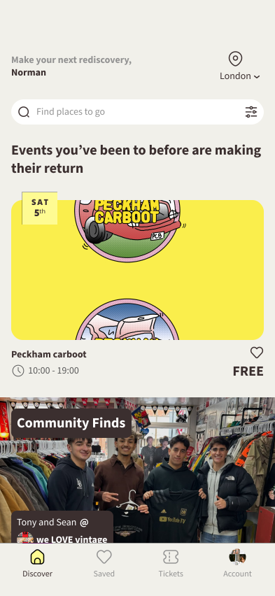


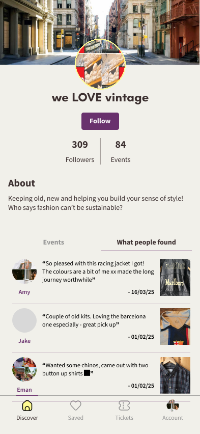


"Understanding who I'm designing for" is a phrase you'll hear me repeat a lot, but it's problems like this one where that user-centric focus really helps in designing solutions. Learning from what the rest of the market does best and adapting those systems to the needs of my target users was, in the end, really fulfilling.
CONCLUDING THOUGHTS
Questions that kept popping up in my mind was what success looks like and how it would be measured.
Qualitative feedback
Surveying users to source whether they're buying from vendors as a result of seeing what others have bought.
Quantitative data
Another approach could be measuring conversion from users tapping on the vendor under "Community Finds", all the way to securing tickets for events run by said vendor.
Additionally, tracking ticket sales of events featured in "Community Finds" to see if the flow correlates to more ticket purchases and how significant the difference is.
Usage of both methods for a clearer picture
The weaknesses of the more quantitive approaches is that it doesn't directly tell us if the user found what they were looking for. However, it allows for larger, more detailed data to be collected and provides more context to the literal answers we'd get from the surveys.